

The old design for PGM (Left) was basically a housing wrapped around the technology with little attention paid to unify the look and feel. Consequently, the look was very fragmented and not fitting for the idea of personalizing the sequencing technology that the name implied.
The ergonomic placement of bottles and functions was based mostly on mechanical constraints, rather than optimal positioning.Color and material choice was arbitrary although some attention was paid to color coding actionable areas.
The touch screen height and angle was optimized for the standing user but was small and was not ideal for users in the seated position.

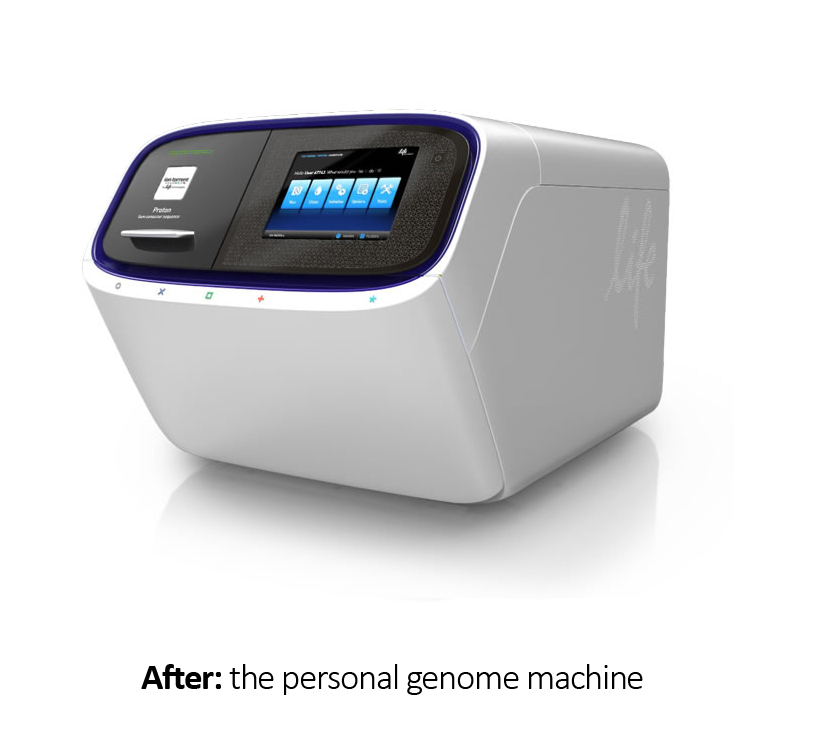
The new PGM ID (left) was completely rethought to make the user experience more akin to a personal product, rather than a piece of lab equipment. This direction was a result of studies and interviews with existing and potential users.
All bottles were hidden behind the front door when not in use. The door handle was enlarged and integrated with the front fascia and easily opened across the entire area by both left hand and right handed users.
The deep blue color choice was taken both from Life's branding system and used as an accent, rather than for large areas. White was chosen for large primary surfaces due to it's ability to be created without relying on paint, thereby rendering it more recyclable.
The new PGM brought very positive press and recognition at a crucial stage in the development of the ID language receiving international awards and recognition.

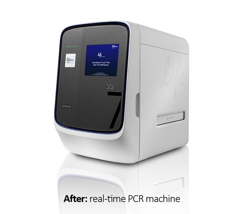
The old look for Life Technologies flagship product (viia 7 PGM) is shown to the left. Although this machine had a more advanced industrial design, it was not a design that adopted well to company wide use on all products. There were several reasons for this.
First, the design was based on breaking up the surfaces into vertical columns which were not applicable to many smaller products in the portfolio. These vertical columns were also broken up by increasingly larger displays. We needed a design that would accentuate, not fight with these larger displays. The central focus area, where the richest material emphasis was put, was the center blue area. This area was not central to the usage of the machine and therefore, somewhat wasted. Lastly, all the design emphasis was in the front area leaving the rest to a very boxy implementation. This too, would not translate well into the many increasingly smaller designs that Life Technologies was challenged to build.

The new design for Life Technologies flagship product (viia 7 PGM) solved many issues mentioned above. The central area was large, enabling a very large display to be used without breaking up the design. The central focus area where most of the money was spent, blended well with the display and was able to be either a hole or a continuous surface depending on the type of touch technology used.
The back and front areas were a unified extrusion that completed the form, rather than looking like a front and a back. This approached worked well for both small and large forms and played a large part in the success and adoption to many smaller sized projects underway at the time.

The development of the PGM and the PCR ID is a small part of a much larger story about creating a new design language for the entire company.
Just prior to this project, I had embarked on a program for revamping Life Technologies design look and feel across all product lines and categories.

The design language has been in constant use since 2011 with many new products created across all categories. It is still evolving and expanding today, even years after Life was purchased by Fischer Scientific. This can be easily seen by a visit to their product website.
The biggest reason for the breadth and depth of adoption cross company is threefold. One is that we made very real and tangible, the rational for choosing the forms and colors we did. For example, we broke the language into 3 levels of adoption including primary, secondary and tertiary, allowing more flexibility for future adoption. We also tied those hierarchies back to personas discovered in our research.
Most importantly, I created and conducted two levels of training aimed specifically at implementation and manufacture. One for executive level management and one for designers and engineers that anticipated and solved application problems before they occurred.